
The Psychology of Logo Design: Creating a Lasting Impression
In the vast and ever-evolving world of business, where first impressions are crucial, the significance of a well-designed logo cannot be overstated. Logos serve as the visual face of a brand, conveying its identity and values in a single glance. Behind the scenes, the process of crafting an effective logo involves more than just aesthetic considerations; it delves into the realms of psychology, tapping into the human mind to create a lasting impression. Let's explore the fascinating interplay between psychology and logo design.
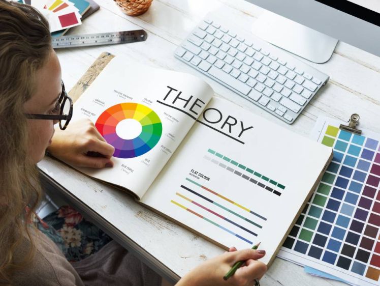
1. Color Psychology:Colors have a profound impact on human emotions and perceptions. When designing a logo, the choice of colors can evoke specific feelings and associations. For example, red is often associated with energy, passion, and urgency, while blue conveys trust, reliability, and calmness. Understanding the psychological nuances of colors allows designers to align a brand's personality with the intended emotional response.
2. Shape and Symbolism:The shapes and symbols within a logo also play a crucial role in influencing consumer perception. Rounded shapes tend to evoke feelings of comfort and friendliness, while angular shapes convey strength and precision. Symbols, such as arrows or circles, can subtly communicate messages of progress, unity, or completeness. The strategic use of shapes and symbols helps to communicate a brand's values and ethos without the need for words.
3. Typography and Readability:The choice of font in a logo contributes significantly to the overall message it conveys. Serif fonts, with their classic and traditional appearance, may suggest reliability and timelessness, while sans-serif fonts exude modernity and simplicity. Beyond aesthetics, the readability of the chosen font is crucial. A clear and legible logo ensures that the brand name or message is easily absorbed, making a quick and lasting impression.
4. Cognitive Fluency:Cognitive fluency refers to the ease with which the human brain processes information. In logo design, simplicity often reigns supreme. Logos that are uncomplicated and easy to understand are more likely to be remembered. Intricate and overly complex designs may overwhelm the viewer, diminishing the likelihood of the logo making a lasting impression.
5. Cultural Sensitivity:Cultural influences shape our perceptions and preferences. A successful logo transcends cultural boundaries, but it is essential to consider cultural nuances when designing. Symbols and colors may carry different meanings in various cultures, and a logo that is culturally sensitive will resonate more effectively with a diverse audience.
6. Brand Consistency:Consistency is key in reinforcing brand identity. A logo should not exist in isolation but should be part of a broader visual identity system. Consistent use of colors, fonts, and imagery across various platforms fosters recognition and strengthens the association between the logo and the brand it represents.
Conclusion
In the intricate dance between psychology and logo design, every element serves a purpose beyond aesthetics. A well-crafted logo is a silent ambassador for a brand, leaving a lasting imprint on the minds of consumers. By harnessing the power of color psychology, shape and symbolism, typography, cognitive fluency, cultural sensitivity, and brand consistency, designers can create logos that resonate, communicate, and endure in the collective consciousness. As businesses continue to navigate the competitive landscape, the psychology of logo design remains an invaluable tool for making a memorable and impactful first impression.